Did you know that 52% of online traffic comes from mobile devices? With more and more people relying on their smartphones and tablets to access the internet, it has become crucial for businesses to optimize their websites for mobile users.
And if you’re in the pest control industry, this is especially important as customers often need quick and easy access to your services. But where do you start? In this discussion, we will explore the key elements and strategies for creating a pest control website that caters to the needs of mobile users.
So, if you want to stay ahead of the competition and provide a seamless experience for your customers, keep reading.
Key Takeaways
- Mobile-friendly design is essential for attracting and retaining customers in the pest control industry.
- Implementing a responsive layout and navigation ensures that users can easily access and navigate your website on mobile devices.
- Optimizing content for mobile users by minimizing file sizes, using concise text, and optimizing images specifically for mobile devices is crucial.
- Mobile-friendly forms and prominent calls-to-action are important for driving conversions and interaction with your pest control website on mobile devices.
Importance of Mobile-Friendly Design

Having a mobile-friendly design is essential for your pest control website to ensure a user-focused experience that’s easily accessible and intuitive. With the increasing number of mobile users, it’s crucial to optimize your website for mobile devices to provide a seamless user experience.
Mobile user experience plays a significant role in attracting and retaining customers. When people visit your website on their mobile devices, they expect it to load quickly and display correctly. A mobile-friendly design ensures that your website is responsive and adapts to different screen sizes, making it easy for users to navigate and find the information they need. By providing a smooth and enjoyable user experience, you increase the chances of converting visitors into customers.
Additionally, mobile SEO optimization is essential for your website’s visibility in search engine results. Google’s algorithm now prioritizes mobile-friendly websites, meaning that having a mobile-friendly design can significantly impact your search engine rankings. By optimizing your website for mobile devices, you increase the chances of appearing higher in search results, driving more organic traffic to your site.
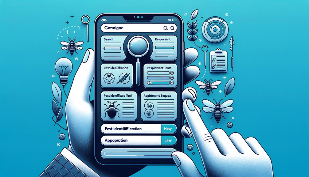
Key Elements for Mobile Optimization
To optimize your pest control website for mobile devices, consider incorporating key elements that enhance user experience and ensure seamless navigation. Here are five essential elements to focus on:
- Responsive Design: Ensure that your website automatically adjusts its layout and content to fit different screen sizes and orientations. This will provide a consistent and user-friendly experience across all devices.
- Clear and Concise Content: Mobile users have limited screen space, so it’s important to prioritize essential information and keep your content concise. Use headings, bullet points, and short paragraphs to make it easier for users to scan and find what they need quickly.
- Intuitive Navigation: Make sure your navigation menu is easy to use and accessible from any page. Use clear labels and avoid clutter to help users find what they’re looking for without any confusion.
- Fast Loading Speed: Mobile users expect your website to load quickly. Optimize your images, minimize code, and leverage caching techniques to reduce loading times. This won’t only improve the user experience but also positively impact your website’s search engine rankings.
- Mobile-Friendly Forms: If you have any forms on your website, make sure they’re optimized for mobile users. Use autocomplete, input validation, and make the fields easily tappable to simplify the form filling process.
Responsive Layout and Navigation
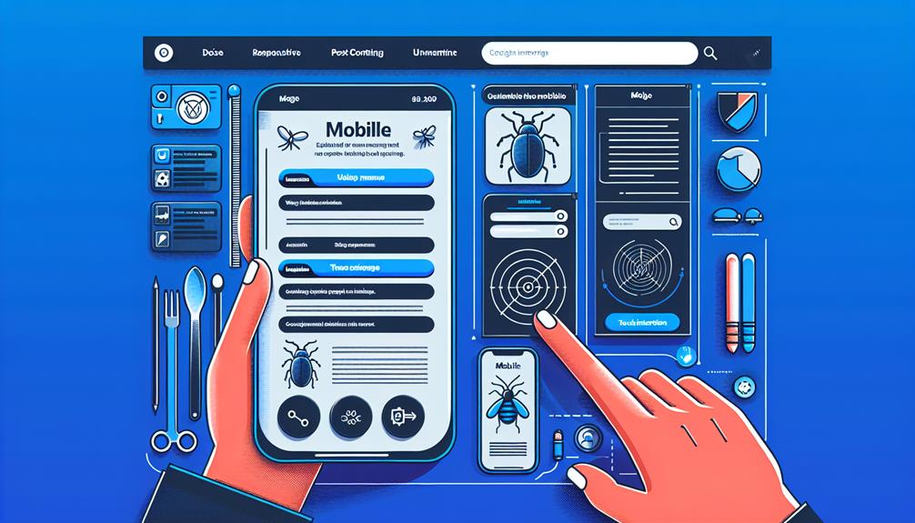
Ensure your pest control website has a responsive layout and intuitive navigation to provide a seamless user experience on mobile devices. With the increasing use of smartphones and tablets, it’s crucial to adapt your website to different screen sizes and resolutions. Responsive design allows your website to automatically adjust its layout and content to fit any device, ensuring that your users can access and navigate your website easily.
A responsive layout ensures that all the important elements of your website are displayed properly, regardless of the screen size. This means that your users won’t have to zoom in or scroll horizontally to view your content. A well-designed layout will make it easy for users to find the information they need quickly and efficiently, enhancing their overall experience.
Intuitive navigation is equally important for a seamless user experience. Your navigation menu should be easy to find and use, with clear labels and logical organization. Users should be able to navigate through your website effortlessly, finding the information they need without any confusion. Incorporating a search function can further enhance the user experience, allowing users to quickly locate specific information.
Optimizing Content for Mobile Users
Optimize your content to enhance the mobile user experience on your pest control website. When it comes to mobile browsing, speed is crucial. Users expect quick loading times, and if your content takes too long to load, they may become frustrated and navigate away from your site. To ensure a smooth and seamless user experience, here are five important aspects to focus on:
- Minimize file sizes: Compress images and videos to reduce their file sizes without compromising quality. This will help your content load faster, improving the overall user experience.
- Use concise and scannable text: Mobile users have limited screen space, so it’s important to keep your content concise and easy to scan. Use headings, bullet points, and short paragraphs to break up text and make it more digestible.
- Optimize images for mobile: Resize and optimize images specifically for mobile devices. This will reduce load times and ensure that images display properly on smaller screens.
- Utilize mobile-friendly formats: Use responsive design and formats that are compatible with mobile devices. This will ensure that your content adapts to different screen sizes and orientations.
- Implement lazy loading: Lazy loading delays the loading of non-visible images and videos until the user scrolls to them. This technique can significantly improve loading speed and enhance the user experience.
Mobile-Friendly Forms and Calls-to-Action

Improve the user experience on your pest control website by making your forms and calls-to-action mobile-friendly. A mobile-friendly user experience is crucial for driving conversions and ensuring that visitors can easily interact with your website on their smartphones or tablets.
When it comes to mobile conversion optimization, one of the key areas to focus on is your forms. Mobile users have a limited screen space, so it’s important to keep your forms concise and easy to fill out. Use dropdown menus, checkboxes, and pre-filled options to streamline the process and make it quick for users to submit their information.
Additionally, make sure that your calls-to-action are prominently displayed and easily clickable on mobile devices. Use large buttons with clear and concise text to guide users towards the desired action.