When it comes to making your pest control website mobile-friendly, there are a few key factors to consider.
Responsive design, user-friendly navigation, optimized load time, clear and readable content, and mobile-friendly forms all play a crucial role in ensuring a seamless experience for your mobile users.
But what specifically makes a pest control website truly mobile-friendly?
Well, let’s dive into each of these elements to find out how they can make a significant impact on your website’s performance and user satisfaction.
Key Takeaways
- Responsive design ensures that a pest control website can adapt to different screen sizes and resolutions, providing a seamless user experience on any device.
- User-friendly navigation with clear and intuitive menu structure prioritizes important pages and uses a vertical scrolling layout for easy browsing on mobile devices.
- Optimized load time is crucial for a mobile-friendly pest control website, as it prioritizes faster access to information by minimizing unnecessary scripts, file sizes, and bottlenecks.
- Clear and readable content, organized with headings and subheadings, concise paragraphs, and legible fonts, ensures easy accessibility and readability on mobile devices.
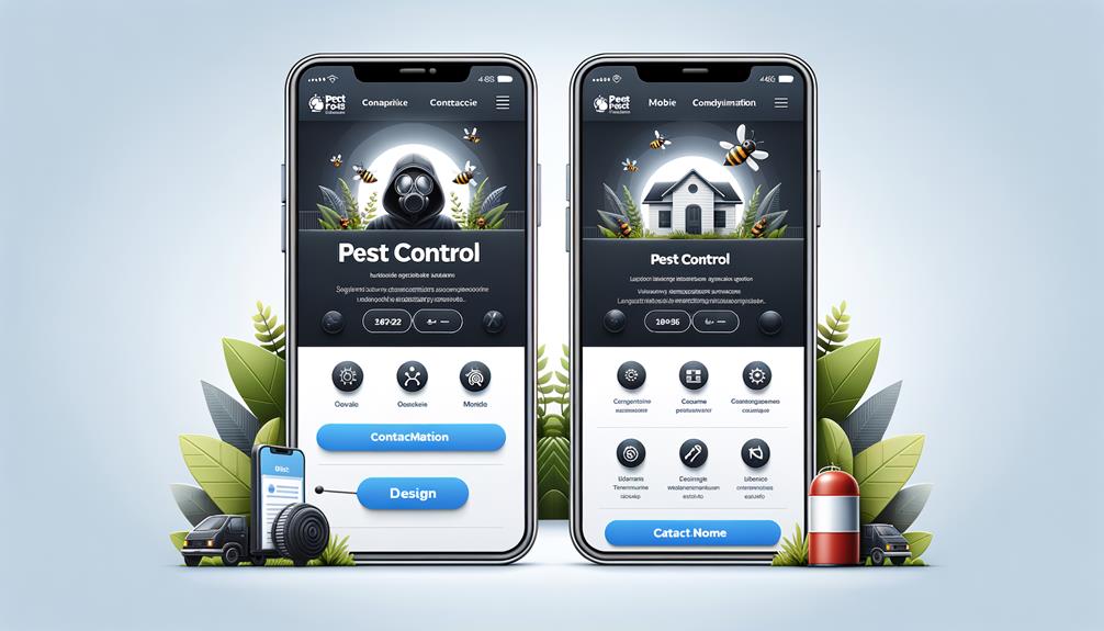
Responsive Design
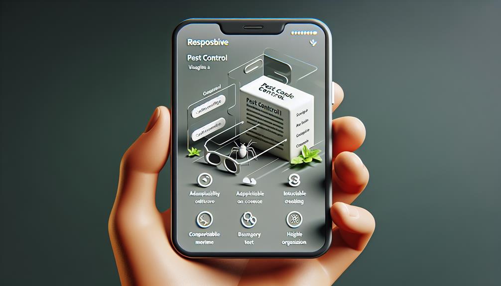
Ensure your pest control website is accessible and easy to navigate on any device with responsive design. Responsive design is a crucial aspect of creating a mobile-friendly website. With the growing number of people accessing the internet through their smartphones and tablets, it’s essential to prioritize mobile accessibility.
Responsive design allows your website to adapt to different screen sizes and resolutions. It ensures that your content is displayed correctly and optimally on any device, whether it’s a desktop, laptop, or mobile device. By implementing responsive design, you provide a seamless user experience, regardless of the device your visitors are using.
A responsive website isn’t only user-friendly but also improves your search engine rankings. Search engines like Google prioritize mobile-friendly websites in their search results. If your website isn’t mobile-friendly, it may be penalized and pushed down in the search rankings.
Having a responsive design also means that you don’t need to create multiple versions of your website for different devices. This saves you time and resources, as you only need to maintain and update one website. Additionally, a responsive design future-proofs your website, as it will adapt to new devices and screen sizes that may emerge in the future.
User-Friendly Navigation
Make it easy for users to navigate your pest control website with a user-friendly menu and clear navigation options. A well-designed navigation system ensures that visitors can easily find the information they need without frustration.
To achieve this, consider the following:
- Clear and intuitive menu: Use a simple and organized menu structure that allows users to access different sections of your site quickly. Avoid cluttering the menu with unnecessary options and prioritize the most important pages.
- Scrolling behavior: Design your website with a vertical scrolling layout to accommodate mobile users who prefer scrolling over clicking. Ensure that the scrolling behavior is smooth and responsive.
- Touch-friendly buttons: Optimize your website for touchscreens by using large, easy-to-tap buttons. This will make it easier for users to navigate your site on mobile devices without accidentally clicking on the wrong links.
Optimized Load Time
To improve the user experience on your pest control website, prioritize optimizing the load time for faster access to information.
A fast-performing website is crucial in today’s fast-paced digital world. Users expect websites to load quickly, and if your website takes too long to load, they’ll likely leave and look for information elsewhere.
Efficient coding is one of the key factors in achieving fast performance. Make sure your website is coded in a way that minimizes unnecessary scripts, reduces file sizes, and eliminates any bottlenecks that could slow down the loading process.
Optimizing images, using caching techniques, and minimizing the use of external resources can also contribute to faster load times.
Regularly test your website’s load time using tools like Google PageSpeed Insights or GTmetrix to identify any areas that need improvement.
Clear and Readable Content
Users appreciate clear and readable content on pest control websites, as it allows them to easily understand and engage with the information provided. When it comes to creating a mobile-friendly layout, easy accessibility is key. Here are a few tips to ensure your content is clear and readable:
- Use a legible font: Choose a font that’s easy to read on mobile devices. Avoid using small fonts or decorative fonts that may be difficult to decipher.
- Break up text with headings and subheadings: Organize your content using headings and subheadings to make it easier for users to scan and find the information they need.
- Write concise and informative content: Keep your paragraphs short and to the point. Avoid long, dense blocks of text that can be overwhelming for mobile users.
Mobile-Friendly Forms
When it comes to optimizing your pest control website for mobile devices, ensuring that your forms are mobile-friendly is essential for a seamless user experience. Mobile-friendly form design is crucial for conversion rate optimization, as it directly impacts how users interact with your website and ultimately whether they complete the desired action.
To create a mobile-friendly form, consider the following design principles. Firstly, keep the form simple and concise, with only essential fields to minimize user effort. Long forms can be overwhelming and frustrating on mobile devices.
Secondly, use responsive design techniques to ensure that the form adapts to different screen sizes and orientations. This will make it easier for users to view and interact with the form on their mobile devices.
Additionally, optimize the form for touch input by using larger buttons and input fields. This will prevent users from accidentally tapping the wrong elements and improve the overall user experience.
Lastly, test the form on different mobile devices and browsers to ensure that it functions correctly and is visually appealing across all platforms.